Genomic Data Analysis
title: “Personalised Medicine - Exploratory Data Analysis” —
Introduction
Once sequenced, a cancer tumor can have thousands of genetic mutations. But the challenge is distinguishing the mutations that contribute to tumor growth (drivers) from the neutral mutations (passengers).
Currently this interpretation of genetic mutations is being done manually. This is a very time-consuming task where a clinical pathologist has to manually review and classify every single genetic mutation based on evidence from text-based clinical literature.
We have been challenged to automatically classify genetic mutations that contribute to cancer tumor growth (so-called “drivers”) in the presence of mutations that are don’t affect the tumors (“passengers”).
The data comes in 4 different files. Two csv files and two text files:
training/test variants: These are csv catalogues of the gene mutations together with the target value Class, which is the (manually) classified assessment of the mutation. The feature variables are Gene, the specific gene where the mutation took place, and Variation, the nature of the mutation. The test data of course doesn’t have the Class values. This is what we have to predict. These two files each are linked through an ID variable to another file each, namely:
training/test text: Those contain an extensive description of the evidence that was used (by experts) to manually label the mutation classes.
The text information holds the key to the classification problem and will have to be understood/modelled well to achieve a useful accuracy.
Load libraries and data files
Data Input Libraries
library('readr')Data Wrangling/Manipulation libraries
library('dplyr')
library('tibble')
library('tidyr')
library('stringr')
library('forcats')
library('tidytext')
library('SnowballC')
Data Visualization Libraries
library('ggplot2') # visualization
library('ggthemes') # visualization
library('scales') # visualization
library('grid') # visualisation
library('gridExtra') # visualisation
library('corrplot') # visualisation
library('ggfortify') # visualisation
library('ggraph') # visualisation
library('igraph') # visualisation
library('wordcloud') # test visualisation
Reading the data into R
train <- read_csv('./data/training_variants')
test  <- read_csv('./data/test_variants')

train_txt_dump <- tibble(text = read_lines('./data/training_text', skip = 1))
train_txt <- train_txt_dump %>%
  separate(text, into = c("ID", "txt"), sep = "\\|\\|")
train_txt <- train_txt %>%
  mutate(ID = as.integer(ID))

test_txt_dump <- tibble(text = read_lines('./data/test_text', skip = 1))
test_txt <- test_txt_dump %>%
  separate(text, into = c("ID", "txt"), sep = "\\|\\|")
test_txt <- test_txt %>%
  mutate(ID = as.integer(ID))
Data Exploration
We start this EDA by Exploring our target variable.
Target Variable
train %>%
  ggplot(aes(Class)) +
  geom_bar()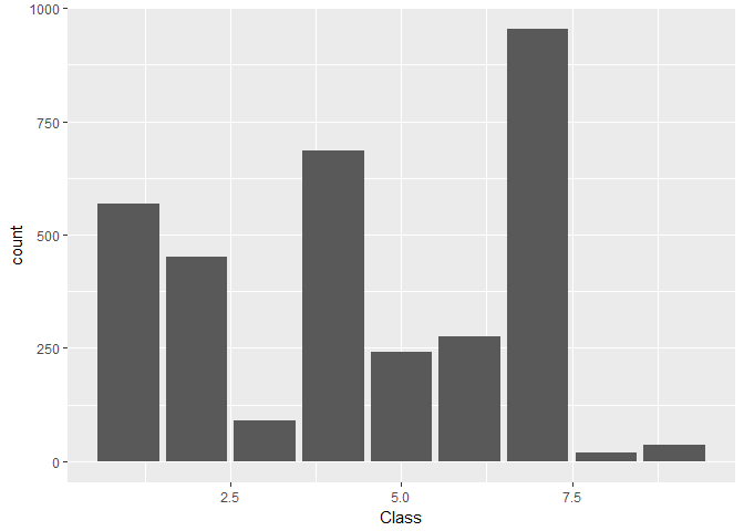
Findings 1
- There are 9 unique classes, with class 7 being the most frequent class and class 8 being the least frequent class.
- The class distrubution is not uniform. class 3, 8, and 9 have very low count, class 5,6 have a medium count and class 1,2,4 and 7 have relatively higher count
Creating Data tables to explore the variants in the data
train <- train %>%
  mutate(Gene = factor(Gene),
         Variation = factor(Variation),
         Class = factor(Class))

test <- test %>%
  mutate(Gene = factor(Gene),
         Variation = factor(Variation))

summary(train, maxsum = 9)
## ID Gene Variation Class
## Min. : 0 BRCA1 : 264 Truncating Mutations: 93 1:568
## 1st Qu.: 830 TP53 : 163 Deletion : 74 2:452
## Median :1660 EGFR : 141 Amplification : 71 3: 89
## Mean :1660 PTEN : 126 Fusions : 34 4:686
## 3rd Qu.:2490 BRCA2 : 125 Overexpression : 6 5:242
## Max. :3320 KIT : 99 G12V : 4 6:275
## BRAF : 93 E17K : 3 7:953
## ALK : 69 Q61H : 3 8: 19
## (Other):2241 (Other) :3033 9: 37glimpse(train)## Observations: 3,321
## Variables: 4
## $ ID <int> 0, 1, 2, 3, 4, 5, 6, 7, 8, 9, 10, 11, 12, 13, 14, 15...
## $ Gene <fctr> FAM58A, CBL, CBL, CBL, CBL, CBL, CBL, CBL, CBL, CBL...
## $ Variation <fctr> Truncating Mutations, W802*, Q249E, N454D, L399V, V...
## $ Class <fctr> 1, 2, 2, 3, 4, 4, 5, 1, 4, 4, 4, 4, 4, 4, 5, 4, 1, ...glimpse(test)## Observations: 5,668
## Variables: 3
## $ ID <int> 0, 1, 2, 3, 4, 5, 6, 7, 8, 9, 10, 11, 12, 13, 14, 15...
## $ Gene <fctr> ACSL4, NAGLU, PAH, ING1, TMEM216, CD40LG, KLF11, SG...
## $ Variation <fctr> R570S, P521L, L333F, A148D, G77A, A123E, T220M, T15...sum(is.na(train))## [1] 0sum(is.na(test))## [1] 0GB_Gene_train <- train %>%
group_by(Gene) %>%
summarise(ct = n()) %>%
arrange(desc(ct))
head(GB_Gene_train)## # A tibble: 6 x 2
## Gene ct
## <fctr> <int>
## 1 BRCA1 264
## 2 TP53 163
## 3 EGFR 141
## 4 PTEN 126
## 5 BRCA2 125
## 6 KIT 99glimpse(GB_Gene_train)## Observations: 264
## Variables: 2
## $ Gene <fctr> BRCA1, TP53, EGFR, PTEN, BRCA2, KIT, BRAF, ALK, ERBB2, P...
## $ ct <int> 264, 163, 141, 126, 125, 99, 93, 69, 69, 60, 56, 52, 50, ...GB_Gene_test <- test %>%
group_by(Gene) %>%
summarise(ct = n()) %>%
arrange(desc(ct))
head(GB_Gene_test)## # A tibble: 6 x 2
## Gene ct
## <fctr> <int>
## 1 F8 134
## 2 CFTR 57
## 3 F9 54
## 4 G6PD 46
## 5 GBA 39
## 6 AR 38glimpse(GB_Gene_test)## Observations: 1,397
## Variables: 2
## $ Gene <fctr> F8, CFTR, F9, G6PD, GBA, AR, PAH, CASR, ARSA, BRCA1, SCN...
## $ ct <int> 134, 57, 54, 46, 39, 38, 38, 37, 30, 29, 29, 29, 27, 26, ...GB_variation_train <- train %>%
group_by(Variation) %>%
summarise(ct = n()) %>%
arrange(desc(ct))
head(GB_variation_train)## # A tibble: 6 x 2
## Variation ct
## <fctr> <int>
## 1 Truncating Mutations 93
## 2 Deletion 74
## 3 Amplification 71
## 4 Fusions 34
## 5 Overexpression 6
## 6 G12V 4glimpse(GB_variation_train)## Observations: 2,996
## Variables: 2
## $ Variation <fctr> Truncating Mutations, Deletion, Amplification, Fusi...
## $ ct <int> 93, 74, 71, 34, 6, 4, 3, 3, 3, 3, 3, 2, 2, 2, 2, 2, ...GB_variation_test <- test %>%
group_by(Variation) %>%
summarise(ct = n()) %>%
arrange(desc(ct))
head(GB_variation_test)## # A tibble: 6 x 2
## Variation ct
## <fctr> <int>
## 1 Truncating Mutations 18
## 2 Deletion 14
## 3 Amplification 8
## 4 Fusions 3
## 5 G44D 2
## 6 A101V 1glimpse(GB_variation_test)## Observations: 5,628
## Variables: 2
## $ Variation <fctr> Truncating Mutations, Deletion, Amplification, Fusi...
## $ ct <int> 18, 14, 8, 3, 2, 1, 1, 1, 1, 1, 1, 1, 1, 1, 1, 1, 1,...freq_gene_train <- train %>%
group_by(Gene) %>%
summarise(ct = n()) %>%
filter(ct > 40)
freq_gene_train %>%
ggplot(aes(reorder(Gene, -ct, FUN = min), ct)) +
geom_point(size = 3) +
labs(x = "Gene", y = "Frequency") +
coord_flip()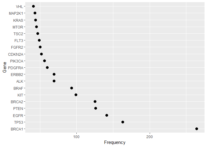
freq_gene_test <- test %>% group_by(Gene) %>% summarise(ct = n()) %>% filter(ct > 40)

freq_gene_test %>% ggplot(aes(reorder(Gene, -ct, FUN = min), ct)) +
  geom_point(size = 3) + labs(x = "Gene", y = "Frequency") +
  coord_flip()
Tr <- train %>% mutate(set = factor("train")) %>% select(-Class, -ID)
Te <- test %>% mutate(set = factor("test")) %>% select(-ID)

F <- full_join(Tr, Te)

F %>%
  group_by(Variation, set) %>% summarise(ct = n()) %>% filter(ct > 3) %>%
  ggplot(aes(reorder(Variation, -ct, FUN = median), ct, colour = set)) +
  geom_point(size = 4) +
  coord_cartesian(ylim = c(0, 100)) +
  labs(x = "Variation", y = "Frequency")
Findings-2
- The Training dataset comprises of 3321 unique IDs with 264 different Gene Expressions and 2996 different variations. Similarly, the test dataset comprises of 5568 unique IDs with 1379 different Gene Expressions and 5628 different variations.
- There are no missing values in variants dataset.
- Some of the test data set is machine generated, which would explain bigger test dataset(vs train dataset).
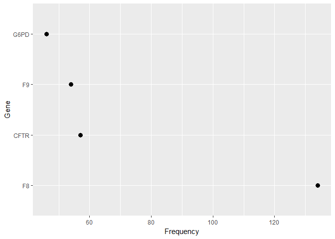
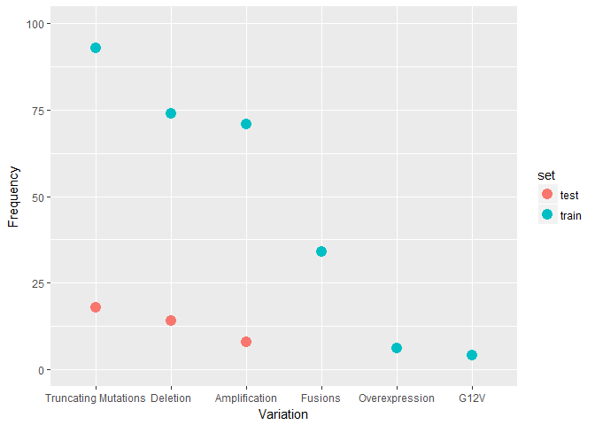
- Most frequent genes in Train Vs Test dataset are very different, but at the same time Most frequent Variations are quite identical.
- A relatively small group of Gene levels make up a sizeable part of the feature values in both train and test data. The test data has fewer high-frequency Genes
Here we see how the Class target is distributed in the train data:train %>%
ggplot(aes(Class)) +
geom_bar()
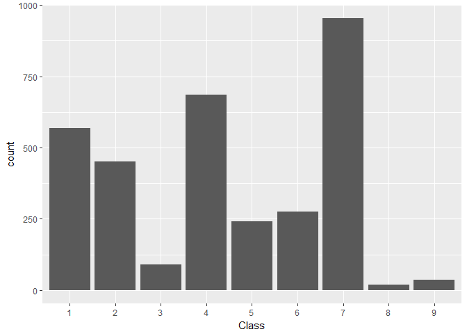
We find:
Class levels 3, 8, and 9 are notably under-represented
Levels 5 and 6 are of comparable, medium-low frequency
Levels 1, 2, and 4 are of comparable, medium-high frequency
Level 7 is clearly the most frequent one
Exploring Feature interactions
Now we want to examine how the features interact with each other and with the target Class variable.
Gene vs Class
First, we will look at the frequency distribution of the overall most frequent Genes for the different Classes. Note the logarithmic frequency scale.train %>%
filter(Gene %in% str_c(freq_gene_train$Gene)) %>%
ggplot(aes(Class)) +
geom_bar() +
scale_y_log10() +
facet_wrap(~ Gene)
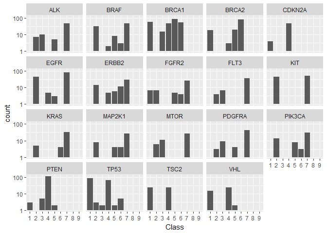
We see immediately that there are significant differences:
Some Genes, like “PTEN”, are predominatly present in a single Class (here: 4).
Other Genes, like “TP53”, are mainly shared between 2 classes (here: 1 and 4).
Classes 8 and 9 contain none of the most frequent Genes.
Here’s what it looks like for the Classes sorted by Genes (again log counts):train %>%
filter(Gene %in% str_c(freq_gene_train$Gene)) %>%
ggplot(aes(Gene)) +
geom_bar() +
scale_y_log10() +
theme(axis.text.x = element_text(angle=90, vjust=0.5, size=8)) +
facet_wrap(~ Class)
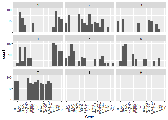
This representation underlines our findings about the similar/dominating Genes in different Classes.
Gene vs Variation
Next, we are somewhat repurposing a count plot to visualise how the Variations are distributed for the most frequent Genes. Since there are so many different variations we drop the y-axis labels and merely illustrate how many Gene - Variation combinations exist in the data.
First the training data:Tr <- train %>%
filter(Gene %in% str_c(freq_gene_train$Gene)) %>%
group_by(Gene, Variation) %>%
summarise(ct = n())
y_labels <- str_sub(Tr$Variation, start = 1, end = 5)
Tr %>%
ggplot(aes(reorder(Gene, ct, FUN = median), reorder(Variation, ct, FUN = median))) +
geom_count() +
geom_point(size = 0.001)+
labs(x = "Gene", y = "Variation") +
theme(axis.text.x = element_text(angle=90, vjust=0.5, size=7),
axis.ticks = element_blank(), axis.text.y = element_blank(),
legend.position = "none")
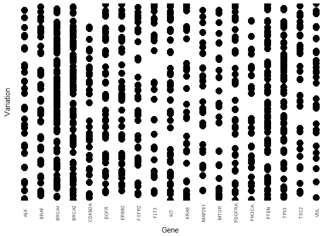
Then the test data:ts <- test %>%
filter(Gene %in% str_c(freq_gene_train$Gene)) %>%
group_by(Gene, Variation) %>%
summarise(ct = n())
y_labels <- str_sub(ts$Variation, start = 1, end = 5)
ts %>%
ggplot(aes(reorder(Gene, ct, FUN = median), reorder(Variation, ct, FUN = median))) +
geom_count() +
labs(x = "Gene", y = "Variation") +
theme(axis.text.x = element_text(angle=90, vjust=0.5, size=7),
axis.ticks = element_blank(), axis.text.y = element_blank(),
legend.position = "none")
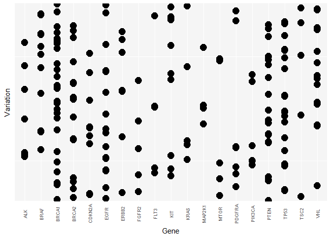
Once more, the two data sets are rather heterogeneous in this view.
The text files
Overview
The second kind of data files contain a whole lot of text from what looks like scientific papers or proceedings. Here is the beginning of the first entry:str_sub(train_txt$txt[1], start = 1, end = 1e3)## [1] "Cyclin-dependent kinases (CDKs) regulate a variety of fundamental cellular processes. CDK10 stands out as one of the last orphan CDKs for which no activating cyclin has been identified and no kinase activity revealed. Previous work has shown that CDK10 silencing increases ETS2 (v-ets erythroblastosis virus E26 oncogene homolog 2)-driven activation of the MAPK pathway, which confers tamoxifen resistance to breast cancer cells. The precise mechanisms by which CDK10 modulates ETS2 activity, and more generally the functions of CDK10, remain elusive. Here we demonstrate that CDK10 is a cyclin-dependent kinase by identifying cyclin M as an activating cyclin. Cyclin M, an orphan cyclin, is the product of FAM58A, whose mutations cause STAR syndrome, a human developmental anomaly whose features include toe syndactyly, telecanthus, and anogenital and renal malformations. We show that STAR syndrome-associated cyclin M mutants are unable to interact with CDK10. Cyclin M silencing phenocopies CDK10"
Sure enough, we can easily confirm that the first part of the complete entry corresponds to this paper and later switches to this one (and maybe other related ones.) Therefore, this data file appears to be a data dump of the complete publication texts for the papers that the classification was based on (including figure captions, manuscript structure, and sometimes affiliations).
I’m suspecting that a little domain knowledge will go a long way here in determining which keywords are important and which ones aren’t. This will be an interesting excercise to see how clearly information is communicated in scientific publications.
On data cleaning and preparations
Here I want to collect various text features, artefacts, and global properties that I noticed during this initial exploration. This list will likely expand as the kernel grows.
Scientific terminology and stop words: Most scientific papers have a common style of language that will be reasonably homogeneous throughout the text files. Words like “result” or “discuss” will be frequent without necessarily containing any signal for our prediction goal. Therefore, below I define my own list of additional stop words.
Research field related stop words: My impression is that the list of stop words could be extended by including characteristic terms of the overall research field that are so ubiquitous that their high frequency may mask genuinely interesting terms. Words such as “mutation”, “cancer”, or “tumor” appear to be too general to have much distinguishing power here. The TF-IDF below seems to confirm this. It would be interesting to get some feedback from people with domain knowledge about which other terms could a-priori be removed from the text.
Paper notation quirks: Converting the paper text straight to ascii leads to a number of artefacts. None of those will have a big impact individually, but together they might reduce the accuracy of the analysis:
- Citation numbers (as used e.g. by Nature magazine) are attached to the corresponding word
- Occasionally, there are what seems like webpage navigation commands like “SectionNext” embedden in the text
- Author names and affiliations are occasionally included
Feature Engineering
Text length - txt_len
train_txt <- train_txt %>%
  mutate(txt_len = str_length(txt),
         set = "train")

test_txt <- test_txt %>%
  mutate(txt_len = str_length(txt),
         set = "test")

combine_txt <- full_join(train_txt,test_txt)
For an early exploration we can look at the distribution of the length of the text features. A priori, I wouldn’t expect the length of a paper to be related to the classification outcome; but maybe some classifications require only a single paper while for others it’s necessary to check multiple ones.
First, here is the overall distribution of the text entry lengths in train vs test:combine_txt %>%
ggplot(aes(txt_len, fill = set)) +
# geom_density(alpha = 0.5, bw = 5e3) +
geom_histogram(bins = 50) +
labs(x = "Length of text entry")
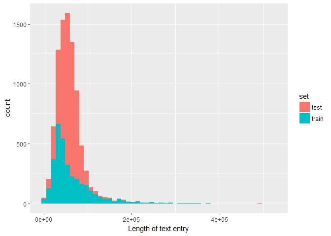
The difference in distribution shape might again be due to the machine-generated entries that have been added to the test sample.
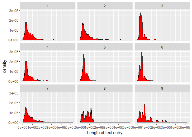
Now, let’s see whether this distribution changes for the different target Classes. First, a facet wrap comparison:foo <- train_txt %>%
select(ID, txt_len)
bar <- train %>%
select(ID, Class)
full_join(foo, bar, by = "ID") %>%
ggplot(aes(txt_len)) +
geom_density(fill = "red", bw = 5e3) +
labs(x = "Length of text entry") +
facet_wrap(~ Class)
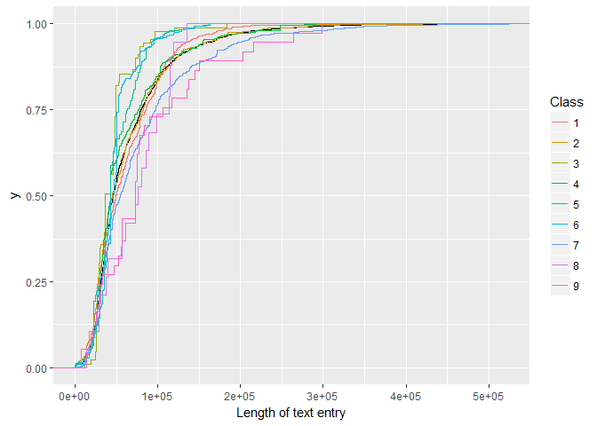
Then an overlay of empirical cumulative density functions:foo <- train_txt %>%
select(ID, txt_len)
bar <- train %>%
select(ID, Class)
full_join(foo, bar, by = "ID") %>%
ggplot(aes(txt_len)) +
stat_ecdf(geom = "step") +
stat_ecdf(aes(txt_len, color = Class), geom = "step") +
labs(x = "Length of text entry")
And the median lengths for each class:foo <- train_txt %>%
select(ID, txt_len)
bar <- train %>%
select(ID, Class)
full_join(foo, bar, by = "ID") %>%
group_by(Class) %>%
summarise(l_med = median(txt_len))## # A tibble: 9 x 2
## Class l_med
## <fctr> <dbl>
## 1 1 49581.5
## 2 2 45434.0
## 3 3 36901.0
## 4 4 42790.0
## 5 5 42863.0
## 6 6 46289.0
## 7 7 54675.0
## 8 8 76146.0
## 9 9 73433.0
We find:
There appear to be significant differences in the shape and median of the test length distributions. Classes 8 and 9 require on average more text, whereas Class 3 has the shortest/fewest papers associated with it.
For what it’s worth, it is tempting to speculate that the apparent multiple peaks in the text length distributions of the individual Classes could correspond to the number of papers that make up the clinical evidence.
Missing text values
In the discussion it was pointed out that a few observations have a “null “ entry in their text features. Using our txt_len feature we can confirm this finding and easily show that there are no other text values with less than 100 characters (just in case a different Null indicator would have been used):combine_txt %>%
filter(txt_len < 100)## # A tibble: 6 x 4
## ID txt txt_len set
## <int> <chr> <int> <chr>
## 1 1109 null 5 train
## 2 1277 null 5 train
## 3 1407 null 5 train
## 4 1639 null 5 train
## 5 2755 null 5 train
## 6 1623 null 5 test
Keyword frequency - pedestrian approach
I want to use this competition to learn more about text mining. While I dive deeper into the applications of the various tools and techniques I will document here what I have learnt. If you are a beginner like me, then maybe this approach will be useful for you. If you are an expert then feel free to skip all the entry-level information (and maybe let me know if I get something seriously wrong.)
Before getting started with specialised tools, here is a first approach based on standard string manipulation methods.
An obvious first step in analysing the content of the clinical evidence is to look how often certain keywords are mentioned in the text of the corresponding papers.
We choose the two words “pathogenic” and “benign” that are used in the naming of the 5 categories in this overview paper. Here we extract their frequency of occurence per observation:train_txt <- train_txt %>%
mutate(f_malignant = str_count(txt, "malignant"),
f_benign = str_count(txt, "benign")
)
Those are the frequency distributions of the word “pathogenic” for our 9 classes (note the logarithmic y-axes):foo <- train_txt %>%
select(ID, f_benign, f_malignant)
bar <- train %>%
select(ID, Class)
full_join(foo, bar, by = "ID") %>%
ggplot(aes(f_malignant)) +
geom_bar() +
scale_y_log10() +
# scale_x_log10() +
facet_wrap(~ Class)
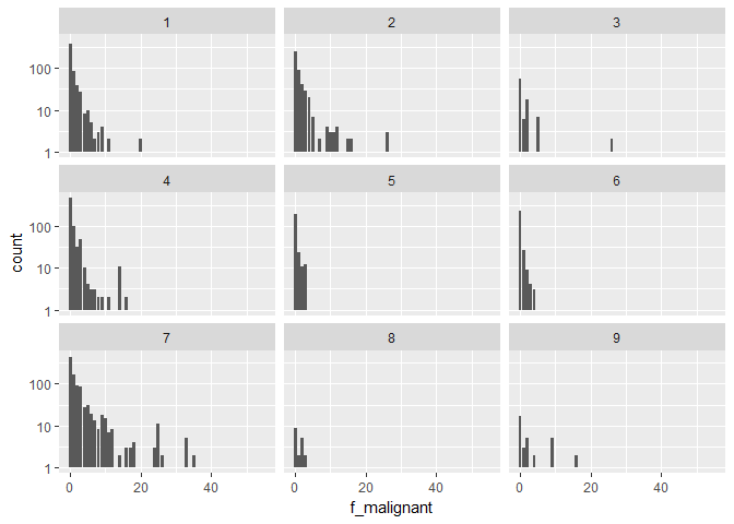
And here we plot the ratio of the mean occurence per class of the word “pathogenic” over the mean occurence of the word “benign”:foo <- train_txt %>%
select(ID, f_benign, f_malignant)
bar <- train %>%
select(ID, Class)
full_join(foo, bar, by = "ID") %>%
group_by(Class) %>%
summarise(mean_benign = mean(f_benign),
mean_malignant = mean(f_malignant),
path_ben = mean(f_malignant)/mean(f_benign)) %>%
ggplot(aes(reorder(Class, -path_ben, FUN = max), path_ben)) +
geom_point(colour = "red", size = 3) +
labs(x = "Class", y = "# occurences 'malignant' / # occurences 'benign'")
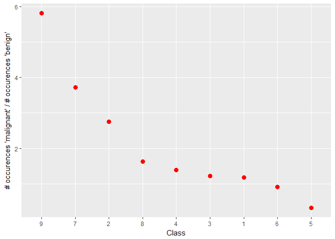
We find:
The facet plot shows that the word “malignant” is clearly more frequent in certain Classes such as 1, 4, or 5
The ratio plot confirms this impression and suggests two distinct groups of Classes: 2, 7, 8, 9 vs 1, 3, 4. The latter have on average a higher ratio of mentions of “malignant” over “benign” than the former. In addition, Classes 5 and 6 have an even higher ratio of “malignant” over “benign”.
Of course, some of these occurences could have said “not malignant” or “not benign”, which is why we will need to dive further into text analysis to tackle this puzzle.
First steps into text analysis with tidytext
As the authors of the tidytext package put it: The tidy text format is being defined as a table with one token per row; with a token being a word or another meaningful unit of text (paraphrased). Through tidy text we can use the powerful tools of the tidyverse to process and analyse text files. I will follow this excellent and free online book.
In order to get our text data in a tidy shape, we use the unnest_tokens tool. This also gets rid of punctuation and converts everything to lowercase:t1 <- train_txt %>% select(ID, txt) %>% unnest_tokens(word, txt)
head(t1)## # A tibble: 6 x 2
## ID word
## <int> <chr>
## 1 0 cyclin
## 2 0 dependent
## 3 0 kinases
## 4 0 cdks
## 5 0 regulate
## 6 0 a
The tidytext package contains a dictionary of stop words, like “and” or “next”, which we can remove from our tidy text data. In addition, we will define our own selection of stop words based on the typical structuring language of scientific papers. We also remove tokens that are only numbers or symbols.data("stop_words")
my_stopwords <- data_frame(word = c(as.character(1:100),
"fig", "figure", "et", "al", "table",
"data", "analysis", "analyze", "study",
"method", "result", "conclusion", "author",
"find", "found", "show", "perform",
"demonstrate", "evaluate", "discuss"))
t1 <- t1 %>%
anti_join(stop_words, by = "word") %>%
anti_join(my_stopwords, by = "word") %>%
filter(str_detect(word, "[a-z]"))
For a first overview, we have a look at the overall most popular words and their frequencies. This is our first serious application of tidyverse and ggplot2 tools to text data:t1 %>%
count(word) %>%
filter(n > 5e4) %>%
mutate(word = reorder(word, n)) %>%
ggplot(aes(word, n)) +
geom_col() +
xlab(NULL) +
coord_flip()
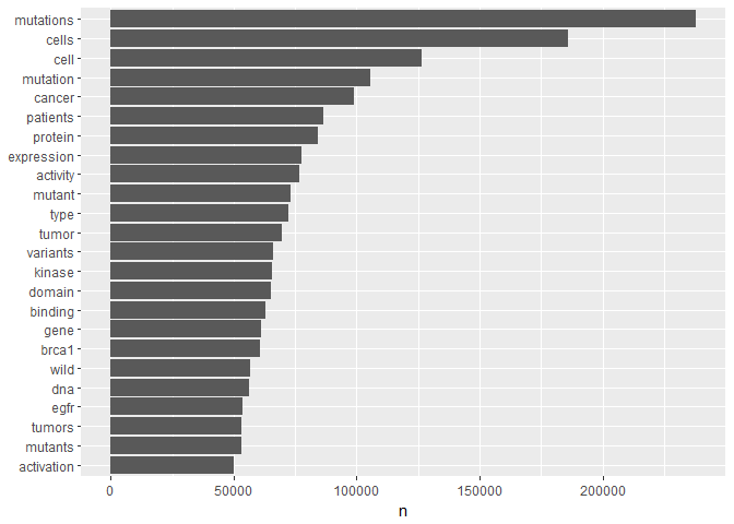
By and large, those are words that we would expect to find in a publication on cancer research and genetics. You will notice that for instance the top 4 words are essentially 2 variants of two basic words each. For our purposes these word variants are likely to obfuscate the signal we are interested in. We can reduce them to their basic meaning, their word stem, using a stemming tool.
As far as I can see, tidytext has currently no native stemming function. Therefore, we will use the “SnowballC” package and its “wordStem” tool:t1 <- t1 %>%
mutate(word = wordStem(word))
t1 %>%
  count(word) %>%
  filter(n > 5e4) %>%
  mutate(word = reorder(word, n)) %>%
  ggplot(aes(word, n)) +
  geom_col() +
  xlab(NULL) +
  coord_flip()
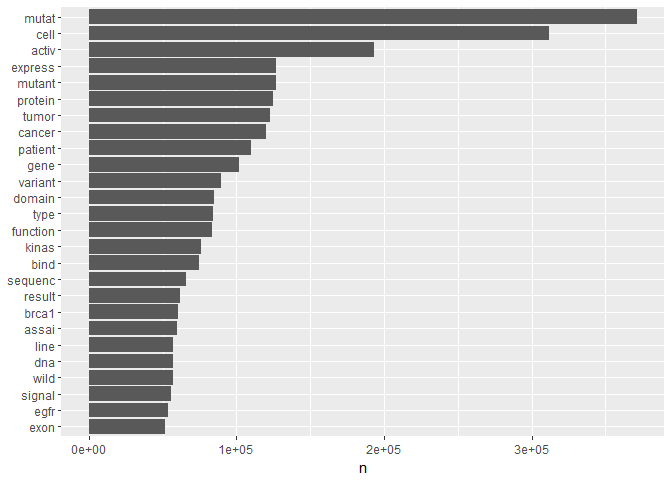
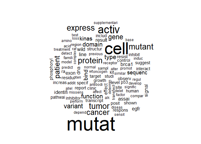
The result shows us the fundamental words that are most frequent in our overall text data. Another way of visualising these frequencies is through a wordcloud. Personally, I suspect that wordclouds might be the text equivalent of pie charts. But it’s useful to know how to incorporate them into tidy text analysis:t1 %>%
count(word) %>%
with(wordcloud(word, n, max.words = 100))
Class-dependent word frequencies
In order to use these word frequencies for prediction we first need to determine them for the individual Classes separately. Below, we join our “text” data with the Class information in the “variants” data set. Afterwards, we determine the relative frequency by Class of each word.
In this example, we will compare Class == 7, the most frequent one, with Classes 1 and 2. Also, we will only look at words with more than 1000 occurences per Class to keep an overview. Here the ability to use dplyr tools starts to pay off properly:foo <- train %>%
select(ID, Class)
t1_class <- full_join(t1, foo, by = "ID")
frequency <-t1_class %>%
count(Class, word) %>%
filter(n > 5e2) %>%
group_by(Class) %>%
mutate(freq = n / sum(n)) %>%
select(-n) %>%
spread(Class, freq) %>%
gather(Class, freq, `1`:`2`)
Then, for a visual overview, we plot the frequency of the words in Class 7 against the other two Classes (note the logarithmic axes):ggplot(frequency, aes(x = freq, y = `7`, color = abs(`7` - freq))) +
geom_abline(color = "gray40", lty = 2) +
geom_jitter(alpha = 0.1, size = 2.5, width = 0.1, height = 0.1) +
geom_text(aes(label = word), check_overlap = TRUE, vjust = 1.5) +
scale_x_log10(labels = percent_format()) +
scale_y_log10(labels = percent_format()) +
#scale_color_gradient(limits = c(0, 0.001), low = "darkslategray4", high = "gray95") +
facet_wrap(~Class, ncol = 2) +
theme(legend.position="none") +
labs(y = "Class 7", x = NULL)
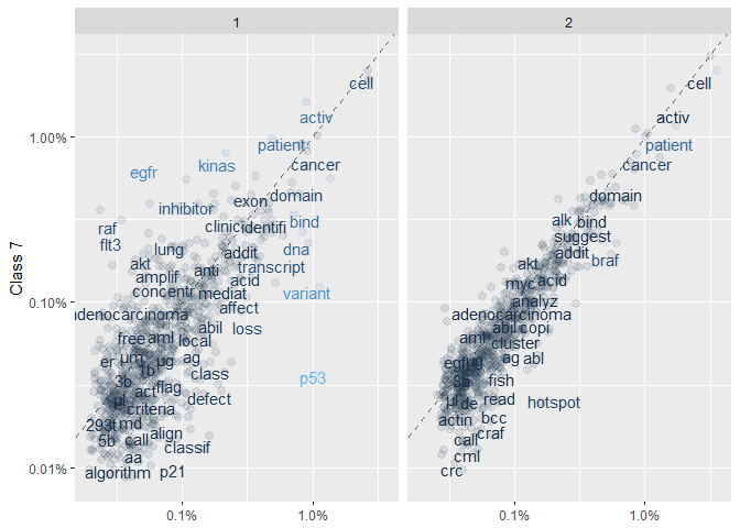
In these plots, words that are close to the dashed line (of equal frequency) have similar frequencies in the corresponding Classes. Words that are further along a particular Class axis (such as “inhibitor” for Class 7 vs 1) are more frequent in that Class. The blue-gray scale indicates how different the Class 7 frequency is from the overall frequency (with higher relative frequencies being lighter). The (slightly jittered) points in the background represent the complete set of (high-frequency) words, whereas the displayed words have been chosen to avoid overlap.
The plots give us a useful overview. For instance, they suggest that Classes 2 and 7 are more similar than 1 and 7. For a more systematic approach we compute the correlation coefficients for each frequency set (this time for the full lists, not just above 1000 occurences):frequency <-t1_class %>%
count(Class, word) %>%
#filter(n > 1e3) %>%
group_by(Class) %>%
mutate(freq = n / sum(n)) %>%
select(-n) %>%
spread(Class, freq)
frequency %>%
select(-word) %>%
cor(use="complete.obs", method="spearman") %>%
corrplot(type="lower", method="number", diag=FALSE)
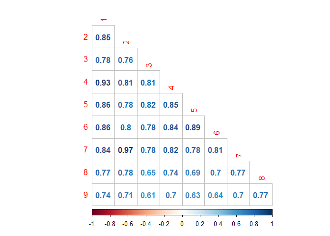
We find:
Classes 2 and 7 are in fact the most similar ones here, followed by 1 and 4 (correlation coefficients above 0.9)
Overall, the most different Class appears to be number 9, in particular compared to classes 3 and 5 (which are not overwhelming similar to each other). Let’s see what word frequency spread looks like for those combinations:
foo <- train %>%
  select(ID, Class)

t1_class <- full_join(t1, foo, by = "ID")

frequency <-t1_class %>%
  count(Class, word) %>%
  filter(n > 2e1) %>%
  group_by(Class) %>%
  mutate(freq = n / sum(n)) %>%
  select(-n) %>%
  spread(Class, freq) %>%
  gather(Class, freq, `3`,`5`)

ggplot(frequency, aes(x = freq, y = `9`, color = abs(`9` - freq))) +
  geom_abline(color = "gray40", lty = 2) +
  geom_jitter(alpha = 0.1, size = 2.5, width = 0.1, height = 0.1) +
  geom_text(aes(label = word), check_overlap = TRUE, vjust = 1.5) +
  scale_x_log10(labels = percent_format()) +
  scale_y_log10(labels = percent_format()) +
  #scale_color_gradient(limits = c(0, 0.001), low = "darkslategray4", high = "gray95") +
  facet_wrap(~Class, ncol = 2) +
  theme(legend.position="none") +
  labs(y = "Class 9", x = NULL)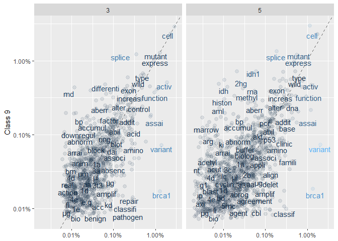
We find:
There is significantly more of a scatter than in the previous set of plots; especially for Class 5 vs 9.
Interestingly, both “benign” and “pathogen” are more frequent in Class 3 vs 9.
TF-IDF analysis - basics and application
As the competition progresses you will probably see this combination of acronyms more and more often in kernels and discussion. And as a beginner like me, you might not know right away what it means. Let’s start with the basics:
TF stands for term frequency; essentially how often a word appears in the text. This is what we measured above. A list of stop-words can be used to filter out frequent words that likely have no impact on the question we want to answer (e.g. “and” or “the”). However, using stop words might not always be an elegant approach. IDF to the rescue.
IDF means inverse document frequency. Here, we give more emphasis to words that are rare within a collection of documents (which in our case means the entire text data.)
Both measures can be combined into TF-IDF, a heuristic index telling us how frequent a word is in a certain context (here: a certain Class) within the context of a larger document (here: all Classes). You can understand it as a normalisation of the relativ text frequency by the overall document frequency. This will lead to words standing out that are characteristic for a specific Class, which is pretty much what we want to achieve in order to train a model.
Tidytext has the function bind_tf_idf to extract these metrics from a tidy data set that contains words and their counts per Class:frequency <-t1_class %>%
count(Class, word)
tf_idf <- frequency %>%
bind_tf_idf(word, Class, n)
Let’s visualise the most characteristic words and their Class:tf_idf %>%
arrange(desc(tf_idf)) %>%
mutate(word = factor(word, levels = rev(unique(word)))) %>%
top_n(20, tf_idf) %>%
ggplot(aes(word, tf_idf, fill = Class)) +
geom_col() +
labs(x = NULL, y = "tf-idf") +
coord_flip()
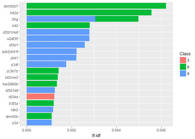
Well, that looks sufficiently technical I suppose. A quick google search reveals that “dnmt3b7” is in fact an “aberrant splice form of a DNA methyltransferase, DNMT3B7, expressed in virtually all cancer cell lines but at very low levels in normal cells.” (citation). Here it seems to be associated to Class 8.
Let’s have an overview of the most characteristic terms in each individual Class:tf_idf %>%
arrange(desc(tf_idf)) %>%
mutate(word = factor(word, levels = rev(unique(word)))) %>%
group_by(Class) %>%
top_n(10, tf_idf) %>%
ungroup() %>%
ggplot(aes(word, tf_idf, fill = Class)) +
geom_col() +
labs(x = NULL, y = "tf-idf") +
theme(legend.position = "none") +
facet_wrap(~ Class, ncol = 3, scales = "free") +
coord_flip()
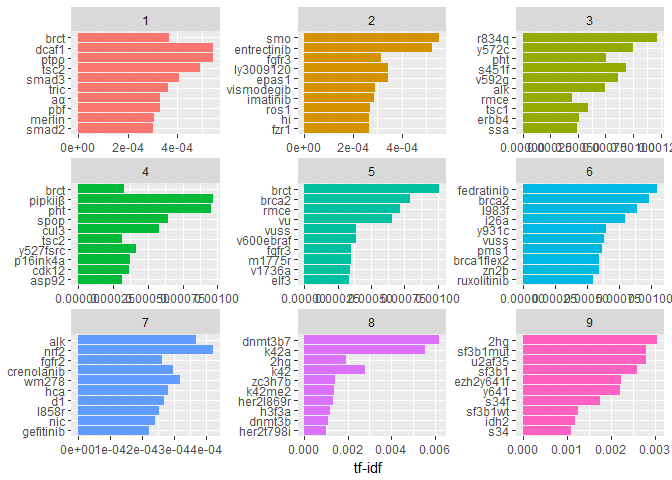
Again, very technical terms here. We notice, though, that some of them (like “brct”) occur in more than one class but still have a high tf-idf.
Word pair frequencies: n-grams
In a similar way as measuring the frequencies of individual words we can also study the properties of groups of words that occur together (like “statistical analysis”). This gives us an idea about the (typical) relationships between words in a certain document.
Tidytext, and other tools, use the concept of the n-gram, which n being the number of adjacent words we want to study as a group. For instance, a bigram is a pair of two words. We can extract all of those pairs in a very similar way as the individual words:t2 <- train_txt %>% select(ID, txt) %>% unnest_tokens(bigram, txt, token = "ngrams", n = 2)
head(t2)## # A tibble: 6 x 2
## ID bigram
## <int> <chr>
## 1 0 cyclin dependent
## 2 0 dependent kinases
## 3 0 kinases cdks
## 4 0 cdks regulate
## 5 0 regulate a
## 6 0 a variety
In order to filter out the stop words we need to separate the bigrams first, and then later unite them back together after the filtering. Separate/unite are also the names of the corresponding dplyr functions:bi_sep <- t2 %>%
separate(bigram, c("word1", "word2"), sep = " ")
bi_filt <- bi_sep %>%
filter(!word1 %in% stop_words$word) %>%
filter(!word2 %in% stop_words$word) %>%
filter(!word1 %in% my_stopwords$word) %>%
filter(!word2 %in% my_stopwords$word)
# for later
bigram_counts <- bi_filt %>%
count(word1, word2, sort = TRUE)
t2 <- bi_filt %>%
unite(bigram, word1, word2, sep = " ")
Estimate tf-idf:foo <- train %>%
select(ID, Class)
t2_class <- full_join(t2, foo, by = "ID")
t2_tf_idf <- t2_class %>%
count(Class, bigram) %>%
bind_tf_idf(bigram, Class, n) %>%
arrange(desc(tf_idf))
And plot the bigrams per Class with the best tf-idf values:t2_tf_idf %>%
arrange(desc(tf_idf)) %>%
mutate(bigram = factor(bigram, levels = rev(unique(bigram)))) %>%
group_by(Class) %>%
top_n(10, tf_idf) %>%
ungroup() %>%
ggplot(aes(bigram, tf_idf, fill = Class)) +
geom_col() +
labs(x = NULL, y = "tf-idf") +
theme(legend.position = "none") +
facet_wrap(~ Class, ncol = 3, scales = "free") +
coord_flip()
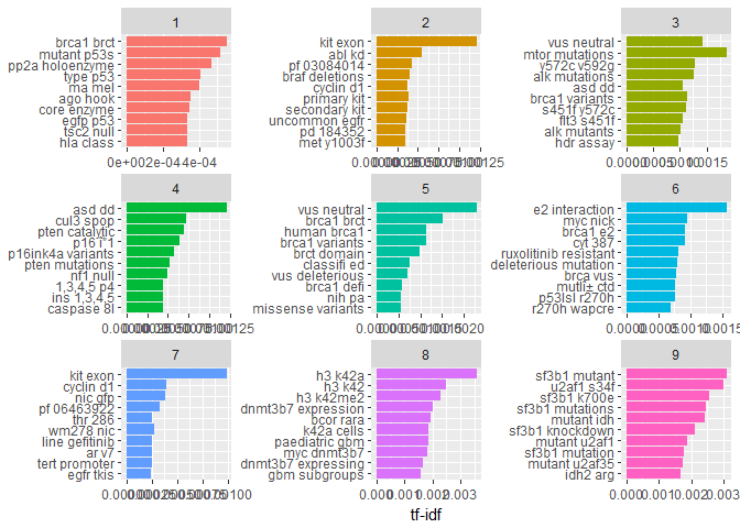
Note, that here we didn’t reduce similar words to their same stem, which leads to similar occurances within Classes (e.g. “dnmt3b7 expression” and “dnmt3b7 expressing” in Class == 8). Still, by and large the contents of the Classes look sufficiently different to be useful for a prediction.
Networks of bigrams
Once we have the bigrams, i.e. sequences of adjacent words, we can also visualise their connections with other words by building a network. A network of words is a combination of connected nodes. Here we use the igraph package to build the network and the ggraph package to visualise it within the context of the tidyverse:bigram_graph <- bigram_counts %>%
filter(n > 4e3) %>%
graph_from_data_frame()
set.seed(1234)
a <- grid::arrow(type = "closed", length = unit(.1, "inches"))
ggraph(bigram_graph, layout = "fr") +
geom_edge_link(aes(edge_alpha = n), show.legend = FALSE,
arrow = a, end_cap = circle(.07, 'inches')) +
geom_node_point(color = "lightblue", size = 3) +
geom_node_text(aes(label = name), vjust = 1, hjust = 1) +
theme_void()
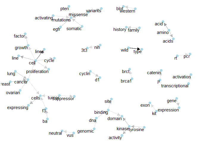
Maybe these networks are not so important for solving this particular problem. But they can give non-biologists like me more of an idea how the various technical concepts are connected.
Here the arrows show the direction of the word relation (e.g. “gene expression” rather than “expression gene”). Transparency is applied to these linking arrows according to the frequency of their occurence (rarer ones are more transparent).
Individual Class networks
Let’s make the same network plots for the individual Classes to investigate their specific terms of importances. In order for this to work, we need to extract the bigram counts separately. For this, we build a short helper function, to which we also assign the flexibility to extract how many bigram combinations to display in the plot. Here, the first parameter of the function is the number of the Class and the second is the lower limit for the bigram word combinations.# input parameters: Class name [1:9], minimum count for bigram graph
plot_bigram_net_class <- function(clname, bimin){
foo <- t2_class %>%
filter(Class == clname)
bar <- foo %>%
separate(bigram, c("word1", "word2"), sep = " ")
bi_filt <- bar %>%
filter(!word1 %in% stop_words$word) %>%
filter(!word2 %in% stop_words$word) %>%
filter(!word1 %in% my_stopwords$word) %>%
filter(!word2 %in% my_stopwords$word)
bigram_graph <- bi_filt %>%
count(word1, word2, sort = TRUE) %>%
filter(n > bimin) %>%
graph_from_data_frame()
set.seed(1234)
a <- grid::arrow(type = "closed", length = unit(.1, "inches"))
ggraph(bigram_graph, layout = "fr") +
geom_edge_link(aes(edge_alpha = n), show.legend = FALSE,
arrow = a, end_cap = circle(.07, 'inches')) +
geom_node_point(color = "lightblue", size = 3) +
geom_node_text(aes(label = name), vjust = 1, hjust = 1) +
theme_void()
}
These are the 9 different plots. We try to keep the network plots relatively sparse, so that we can see the important connections more clearly. Feel free to experiment with larger numbers of bigrams here.
In the following, I also note a few terms or combinations that appear characteristic to me. As an absolute non-expert, I will probably also note a few trivial terms that don’t relate to our challenge. As the competition goes on, I hope to pick up a few hints on how to clean our input data.plot_bigram_net_class(1,8e2)
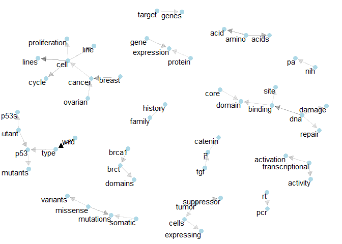
Class 1: We see the connections for “p53” and “brct”. We also find the bigram “tumor supressor”.plot_bigram_net_class(2, 6.5e2)
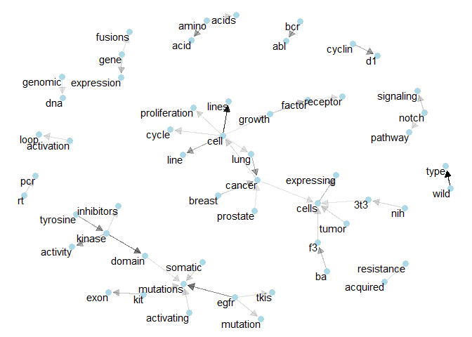
Class 2: We see how “ba”, “f3”, and “3t3” related to “cancer cells”.plot_bigram_net_class(3, 2e2)
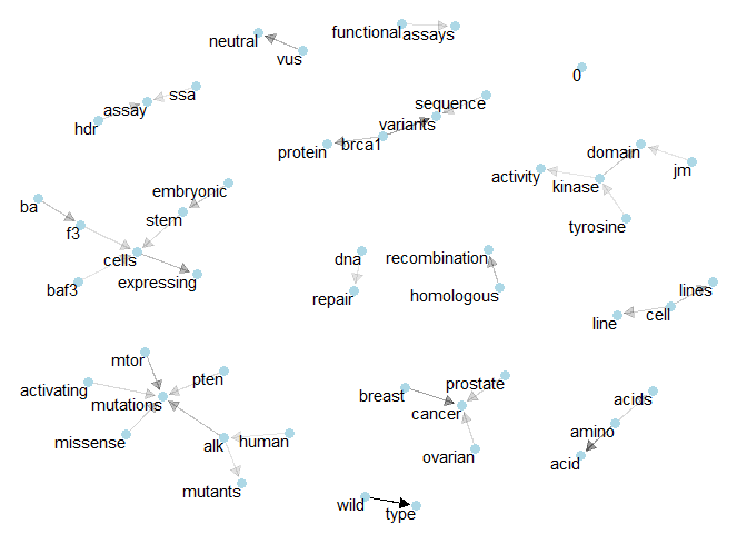
Class 3: Here, “baf3” and “brca1” seem to be important. Maybe “tyronise kinase” too.plot_bigram_net_class(4, 1e3)
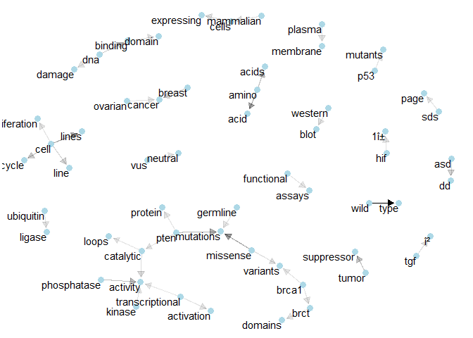
Class 4: Here we have “brca1” and “brct” again, together with another prominent show of “tumor suppressor”.plot_bigram_net_class(5, 5e2)
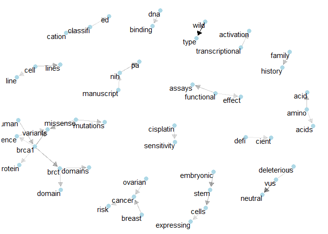
Class 5: We’ve got “cisplatin sensitivity” and the network of “brca1”.plot_bigram_net_class(6, 5e2)
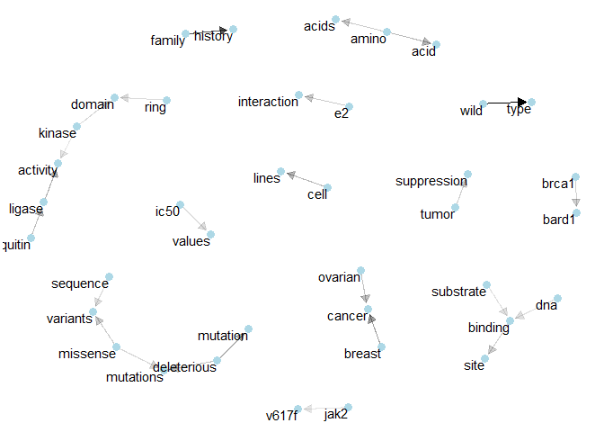
Class 6: Once more “tumor suppression” and also “e2 interaction”.plot_bigram_net_class(7, 2e3)
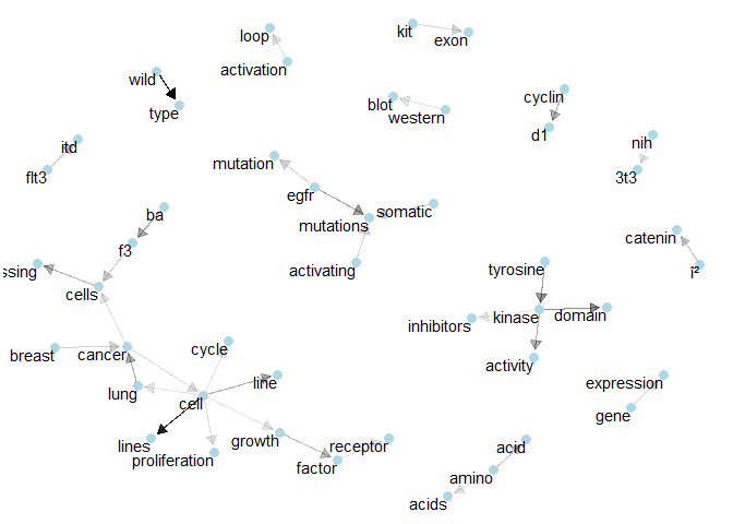
Class 7: Here, “egfr” seems to be important for “mutations” and several isolated bigrams can be spotted.plot_bigram_net_class(8, 5e1)
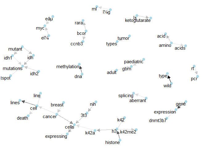
Class 8: Here we see relatively many connections of 3 terms, like “bcor” with “ccnb3” and “rara” or “gbm” with “adult” and “paediatric”.plot_bigram_net_class(9, 1.2e2)
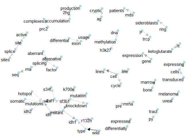
Class 9: One of the denser networks here shows the relations that connect “idh1” and “u2af1”.
–
Thanks to Heads and Tails on Kaggle for the amazing kernel that inspired this work.